1. Empirical Regularities#
import os
import warnings
warnings.simplefilter(action='ignore', category=FutureWarning)
import pandas as pd
import numpy as np
from matplotlib.lines import Line2D
import seaborn as sns
Why the study of economic growth and its attendant economic development issues?
Before we begin with our study proper, let’s gaze at some data.
Like stargazers thousands of years before us, economists seek to discover how much observed, or more precisely, measured “reality” will motivate us with questions.
These questions further drive us to develop useful frameworks for causal reasoning.
1.1. The Maddison Dataset#
Let us begin by taking a look at the Maddison Project Database 2020 dataset. Some tasks are inspired by Omer Ozak’s notes.
STEP 1. Check or create folders for storing data and graphs.
data_dir = './data/'

if not os.path.exists(data_dir):
    os.mkdir(data_dir)
STEP 2. Get the data.
# Database vintage
db_year = "2020"
db_region_year = "2018"
stata_dformat = ".dta"

# Filenames
mad_stata = "Maddison" + db_year + stata_dformat
madregion_stata = "Maddison" + db_region_year + "_region" + stata_dformat

try:
    # if previously downloaded to directory ``data_dir``
    df_mad = pd.read_stata(data_dir + mad_stata)
    df_madregion = pd.read_stata(data_dir + madregion_stata)
except:
    # otherwise download from Groningen Growth and Development Centre ...
    mad_url = "https://www.rug.nl/ggdc/historicaldevelopment/maddison/data/"
    df_mad = pd.read_stata(mad_url + "mpd2018.dta")
    df_madregion = pd.read_stata(mad_url + "mpd2018_region_data.dta")
    # then write/save to STATA file with new name
    df_mad.to_stata(data_dir + mad_stata,
                    write_index=False, version=117)
    df_madregion.to_stata(data_dir + madregion_stata,
                          write_index=False, version=117)
STEP 3. Quick inspection of the dataframes.
df_mad
| countrycode | country | year | gdppc | pop | |
|---|---|---|---|---|---|
| 0 | AFG | Afghanistan | 1820 | NaN | 3280.00000 |
| 1 | AFG | Afghanistan | 1870 | NaN | 4207.00000 |
| 2 | AFG | Afghanistan | 1913 | NaN | 5730.00000 |
| 3 | AFG | Afghanistan | 1950 | 1156.0000 | 8150.00000 |
| 4 | AFG | Afghanistan | 1951 | 1170.0000 | 8284.00000 |
| ... | ... | ... | ... | ... | ... |
| 21677 | ZWE | Zimbabwe | 2014 | 1594.0000 | 13313.99205 |
| 21678 | ZWE | Zimbabwe | 2015 | 1560.0000 | 13479.13812 |
| 21679 | ZWE | Zimbabwe | 2016 | 1534.0000 | 13664.79457 |
| 21680 | ZWE | Zimbabwe | 2017 | 1582.3662 | 13870.26413 |
| 21681 | ZWE | Zimbabwe | 2018 | 1611.4052 | 14096.61179 |
21682 rows × 5 columns
df_madregion
| region | region_name | year | cgdppc | rgdpnapc | pop | |
|---|---|---|---|---|---|---|
| 0 | af | Africa | 1870.0 | NaN | NaN | NaN |
| 1 | af | Africa | 1871.0 | NaN | NaN | NaN |
| 2 | af | Africa | 1872.0 | NaN | NaN | NaN |
| 3 | af | Africa | 1873.0 | NaN | NaN | NaN |
| 4 | af | Africa | 1874.0 | NaN | NaN | NaN |
| ... | ... | ... | ... | ... | ... | ... |
| 1034 | wd | World | 2012.0 | 13821.0 | 13818.0 | 6992923.0 |
| 1035 | wd | World | 2013.0 | 14038.0 | 14090.0 | 7072213.0 |
| 1036 | wd | World | 2014.0 | 14261.0 | 14376.0 | 7152269.0 |
| 1037 | wd | World | 2015.0 | 14500.0 | 14616.0 | 7231375.0 |
| 1038 | wd | World | 2016.0 | 14574.0 | 14692.0 | 7311687.0 |
1039 rows × 6 columns
Note that the year series in df_madregion contains floating-point numbers or floats.
df_madregion["year"].dtype
dtype('float32')
That is not so nice. (Why?) Let’s change that into integers.
df_madregion["year"] = df_madregion["year"].astype(int)
df_madregion["year"].dtype
dtype('int64')
df_madregion
| region | region_name | year | cgdppc | rgdpnapc | pop | |
|---|---|---|---|---|---|---|
| 0 | af | Africa | 1870 | NaN | NaN | NaN |
| 1 | af | Africa | 1871 | NaN | NaN | NaN |
| 2 | af | Africa | 1872 | NaN | NaN | NaN |
| 3 | af | Africa | 1873 | NaN | NaN | NaN |
| 4 | af | Africa | 1874 | NaN | NaN | NaN |
| ... | ... | ... | ... | ... | ... | ... |
| 1034 | wd | World | 2012 | 13821.0 | 13818.0 | 6992923.0 |
| 1035 | wd | World | 2013 | 14038.0 | 14090.0 | 7072213.0 |
| 1036 | wd | World | 2014 | 14261.0 | 14376.0 | 7152269.0 |
| 1037 | wd | World | 2015 | 14500.0 | 14616.0 | 7231375.0 |
| 1038 | wd | World | 2016 | 14574.0 | 14692.0 | 7311687.0 |
1039 rows × 6 columns
Let us re-index or project the original dataframes df and df_madregion by or onto the year series. This will turn out to be useful for plotting things later!
See this useful pandas lecture here for more information.
df = df_mad.set_index(["year"])
dfr = df_madregion.set_index(["year"])
Let’s have a look at a snippet of the dataframe. Here’s a first few rows:
df.head()
| countrycode | country | gdppc | pop | |
|---|---|---|---|---|
| year | ||||
| 1820 | AFG | Afghanistan | NaN | 3280.0 |
| 1870 | AFG | Afghanistan | NaN | 4207.0 |
| 1913 | AFG | Afghanistan | NaN | 5730.0 |
| 1950 | AFG | Afghanistan | 1156.0 | 8150.0 |
| 1951 | AFG | Afghanistan | 1170.0 | 8284.0 |
Here’s the last few rows:
dfr.tail()
| region | region_name | cgdppc | rgdpnapc | pop | |
|---|---|---|---|---|---|
| year | |||||
| 2012 | wd | World | 13821.0 | 13818.0 | 6992923.0 |
| 2013 | wd | World | 14038.0 | 14090.0 | 7072213.0 |
| 2014 | wd | World | 14261.0 | 14376.0 | 7152269.0 |
| 2015 | wd | World | 14500.0 | 14616.0 | 7231375.0 |
| 2016 | wd | World | 14574.0 | 14692.0 | 7311687.0 |
1.1.1. Postcards for our journey ahead#
We will also select a few countries for comparison.
# Specify your selected countries as list
country_list = ["United States",
                "United Kingdom",
                "Australia",
                "China",
                "Spain",
                "Nigeria",
                "Botswana",
                "Singapore",
                "Argentina",
                "Brazil",
                "India"]
We’ll reshape the dataframe df to be able to plot the time series of log real GDP by each country.
# Reshape df
df_pivot = df.reset_index().pivot(index="year",
                                  columns="country",
                                  values="gdppc")
df_sel = df_pivot[country_list]
df_sel = df_sel.dropna().apply(np.log)

# Auto marker styles, for plotting
marker_style = list(Line2D.markers.keys())
Exercise 1.1
Why did we transform the real GDP data series above into their natural logarithms?
# Now plot it
title = "Log real GDP per capita"
df_sel.plot(
            ylabel=title,
            style=marker_style,
            linestyle="--",
            markersize=4.5,
           ).legend(
                    loc='best',
                    bbox_to_anchor=(0.9, 0.5, 0.5, 0.5),
                   );
Exercise 1.2
Comment on the evolution of (log) per-capita GDP of the countries in the figure above.
Use the United States as a reference country. Comment on the trajectories of Singapore, Botswana, Brazil and Spain.
What economic questions can we potentially be asking?
We do the same too for the by-region sorted dataframe dfr:
dfr["lrgdpnapc"] = dfr["rgdpnapc"].apply(np.log)
dfr
| region | region_name | cgdppc | rgdpnapc | pop | lrgdpnapc | |
|---|---|---|---|---|---|---|
| year | ||||||
| 1870 | af | Africa | NaN | NaN | NaN | NaN |
| 1871 | af | Africa | NaN | NaN | NaN | NaN |
| 1872 | af | Africa | NaN | NaN | NaN | NaN |
| 1873 | af | Africa | NaN | NaN | NaN | NaN |
| 1874 | af | Africa | NaN | NaN | NaN | NaN |
| ... | ... | ... | ... | ... | ... | ... |
| 2012 | wd | World | 13821.0 | 13818.0 | 6992923.0 | 9.533728 |
| 2013 | wd | World | 14038.0 | 14090.0 | 7072213.0 | 9.553221 |
| 2014 | wd | World | 14261.0 | 14376.0 | 7152269.0 | 9.573316 |
| 2015 | wd | World | 14500.0 | 14616.0 | 7231375.0 | 9.589872 |
| 2016 | wd | World | 14574.0 | 14692.0 | 7311687.0 | 9.595058 |
1039 rows × 6 columns
dfr.groupby("region_name")["rgdpnapc"].plot(style=marker_style,
                                            linestyle="--",
                                            legend=True,
                                            );
1.1.2. Cross-country inequality over time#
Let’s take snapshots of the distribution of income per capita across countries.
We’ll pick a few same years for the snapshots to see how the distributions evolve of the decades.
# Sample snapshot years
select_years = [1950,1980,2008, 2018]

# Apply the sample years, transpose the dataframe
# just for ease of reading. We'll assign this to a
# new dataframe, df_dens
df_dens = df_pivot.loc[select_years].T
Instead of plotting the empirical distributions as histograms, we’ll fit smooth kernel density estimators of these.
First, let’s take a look at the distributions over the level of real GDP per capita:
# Kernel density estimates
df_dens.plot.kde( style=marker_style,
                  markersize=3.5,
                  linestyle="-",
                  title="Cross-country density estimates by GDP per capita",
                );
Second, we will look at the densities of the natural log transform of the same data:
df_pivot_log = df_pivot.apply(np.log)
df_pivot_log_dens = df_pivot_log.loc[select_years].T

figure_title="Cross-country density estimates by log GDP per capita"
df_pivot_log_dens.plot.kde( style=marker_style,
                            markersize=3.5,
                            linestyle="-",
                            title=figure_title,
                          );
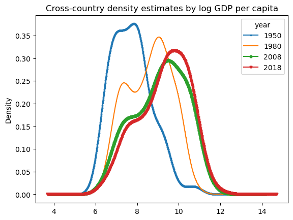
Exercise 1.3
Comment on the figures above.
What can you conclude about world income per capita and inequality as time progressed?
What sorts of questions can we ask?
Hint: Read Chapter 1.1 to 1.4 of Acemoglu [1]!
1.2. Conditional Convergence#
Let’s work with a concrete example:
We want to import some data about countries and their long-run macroeconomic outcomes.
Original data source: Penn World Tables data provided through the Groningen Growth and Development Centre.
This example was adapted from Jon Conning’s material.
Let’s download the data …
data_dir = './data/'

if not os.path.exists(data_dir):
    os.mkdir(data_dir)
filename = "country.dta"
URL = "https://github.com/jhconning/Dev-II/blob/master/notebooks/data/"

try:
    # if previously downloaded to directory ``data_dir``
    df = pd.read_stata(data_dir + filename)
except:
    # otherwise download from J. Conning's repo ...
    # Escape to server shell (!) and use WGET to download to current directory
    !wget -L "https://github.com/jhconning/Dev-II/blob/master/notebooks/data/country.dta?raw=true" -O country.dta
    # import data as a Pandas dataframe:
    df = pd.read_stata("country.dta")

    # then write/save to directory ``data_dir``
    df.to_stata(data_dir + filename,
                    write_index=False, version=117)
# Display dataframe content
df
| isocode | country | cont | ggdp | gpop | open60 | sav60 | lxrd60 | lxrdav | savav | openav | lgdp60 | lpop60 | |
|---|---|---|---|---|---|---|---|---|---|---|---|---|---|
| 0 | GHA | Ghana | Africa | 2.990764 | 2.577389 | 67.866135 | 60.527485 | 0.852252 | 0.600432 | 13.394326 | 42.227081 | -0.634748 | 1.939933 |
| 1 | MAR | Morocco | Africa | 2.453598 | 2.214207 | 46.277290 | 9.332626 | 0.503584 | 0.918777 | 11.590545 | 47.401264 | 0.515019 | 2.519584 |
| 2 | COM | Comoros | Africa | -0.014582 | 2.878329 | 57.538712 | 6.700409 | 1.902229 | 1.482772 | 11.446098 | 57.030586 | 0.555129 | -1.698821 |
| 3 | MLI | Mali | Africa | 0.755422 | 2.165016 | 42.134323 | 4.308089 | 1.916554 | 1.203254 | 8.405947 | 48.412022 | 0.020564 | 1.500997 |
| 4 | GAB | Gabon | Africa | 1.268704 | 2.521714 | 72.452179 | 20.357958 | 1.315058 | 0.710294 | 7.738871 | 94.919189 | 2.073140 | -0.807430 |
| ... | ... | ... | ... | ... | ... | ... | ... | ... | ... | ... | ... | ... | ... |
| 92 | CHL | Chile | S. America | 1.848451 | 1.730081 | 29.795073 | 29.349722 | 0.650374 | 0.655199 | 18.732784 | 43.862640 | 1.846538 | 2.026219 |
| 93 | DOM | Dominican Republic | S. America | 2.663763 | 2.374352 | 68.969223 | 5.131092 | 0.606269 | 0.755264 | 10.170477 | 76.201607 | 0.998264 | 1.172943 |
| 94 | BRB | Barbados | S. America | 1.812256 | 0.411359 | 98.748535 | 5.806423 | 1.417267 | 0.932263 | 4.997591 | 114.205284 | 2.162862 | -1.459558 |
| 95 | URY | Uruguay | S. America | 1.352161 | 0.688982 | 17.299664 | 14.389812 | 0.324334 | 0.583185 | 13.030991 | 33.351215 | 1.965475 | 0.928602 |
| 96 | PAN | Panama | S. America | 2.719175 | 2.262045 | 132.864792 | 14.117195 | 0.334513 | 0.488325 | 18.435352 | 155.472107 | 1.157346 | 0.137681 |
97 rows × 13 columns
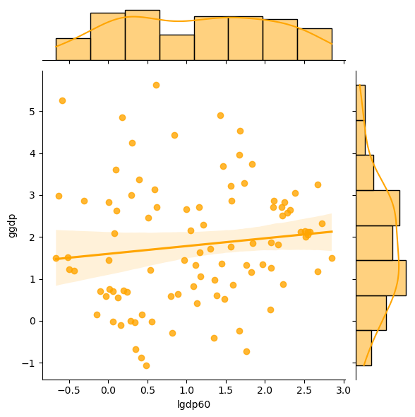
The series of interest here are cross-country observations of
lgdp60(the log of per-capita real GDP in the year 1960), and,ggdp(the average growth rate between 1960 and 1990).
Let’s plot their relationship as scatterplots, clustered by:
all countries, and,
all countries excluding African continent countries.
1.2.1. All Countries#
g = sns.jointplot(x="lgdp60", y="ggdp",
                  data=df,
                  kind="reg",
                  color ="orange")
1.2.2. All but African countries#
g = sns.jointplot(x="lgdp60", y="ggdp",
                  data=df[df.cont !="Africa"],
                  kind="reg",
                  color ="green")
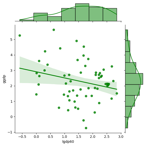
1.2.3. Exercise#
Exercise 1.4
Comment on the two scatterplot above.
What does the last figure suggest about the possibility of some poorer countries catching up to the richer ones?
Exercise 1.5
What is conditional convergence in cross-country incomes per capita?
How do economists (Robert Barro) take the casual, scatterplot motivations above to find evidence of conditional convergence?
Provide a detailed discussion of the empirical method and model and the evidence discovered.
1.3. Further reading#
Quah [21] uses data from a large number of countries to analyze the dynamics of cross-country income inequality and economic growth. He was the first to document the “emerging twin-peaks” phenomenon in the cross-sectional distribution of income across countries. See also the survey article by Jones [12].
Acemoglu, Johnson, and Robinson [2] suggest that the world income distribution underwent a ‘reversal of fortune’ from 1500 to the present. In their study, they claim that formerly rich countries in the current developing world became poor while some poor countries had grown rich. They hypothesize that this reversal was driven by changes in institutions arising from European colonialism. (The authors use data on urbanization patterns and population density, arguing that these are good proxies for economic prosperity.) Acemoglu, Naidu, Restrepo, and Robinson [3] make a further causal claim that democracy is an important institution that has a positive effect on GDP per capita.